Reviving a Legacy: The Newark Eagles Take Flight with a Modern Brand Story
A Historic Negro League team reimagined through a more modern lens.
Written by: Ahmad Thomas
19.September 2025

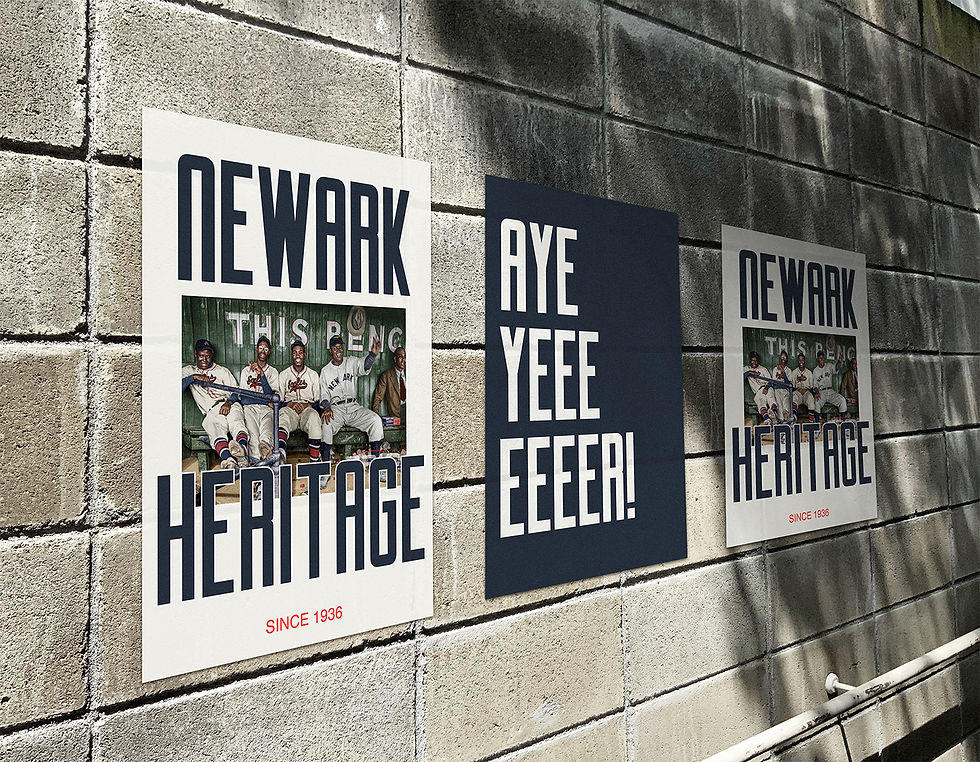
Newark is recognized worldwide as Brick City. Its tough exterior reflects the hard-nosed, blue-collar culture that embodies the spirit of the people who call it home. Just 15 miles from Manhattan, Newark stands in the shadow of no one. There’s an electricity that pulses through this city—a richness of heritage and generations of talent who proudly pay homage to Newark as the place that shaped them and contributed directly to their greatness.
What many don’t know is that Newark has long been an epicenter of sports, art, medicine, and cultural renaissance. So, when I was approached by the City’s Legacy & Preservation Office with the task of rebranding one of our city’s historical gems, it felt like a full-circle moment. As a native of this beautiful city, I understood the weight of the responsibility—not just to create a brand for an institution, but to find a way to communicate the soul of a city. The smiles of its people, the authenticity of their disposition, their fight, their love, their resolve. A community that has overcome so many obstacles yet remains bound together through pride.
Despite the challenge, I saw this as an opportunity to celebrate two things we hold close: our resilience and our connection to beauty. From the very beginning, it was clear that I wasn’t just designing a brand—I was creating a physical representation that could foster a cult-like following.
.jpg)
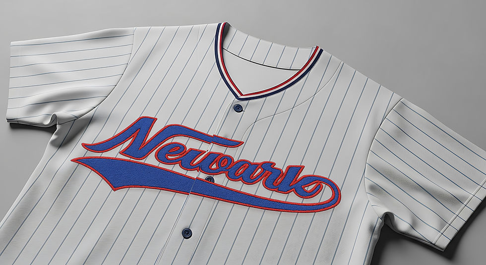
I was immediately drawn to the cultural significance this team held in the 1960s. I didn’t want to erase that legacy; I wanted to lean into it, to build upon the ideas formed in an era when many underserved communities and institutions didn’t have access to the same vehicles of design. There’s a certain beauty in that struggle—a beauty found at the bottom. It’s been more than 20 years since Newark had a professional baseball club to rally behind, following the discontinuation of the Newark Bears (ALPB). My goal was to blend the proud legacy of the Negro League Eagles with the powerful aesthetic impact the Newark Bears had on me growing up here in the 90s.

.jpg)


The club’s old badge told a story. It reflected how people used what they had to create what they needed out of necessity. That patch inspired me beyond words—it was a reminder of a time when Black players didn’t have access to the same resources as their white counterparts. They created their own logos, took their uniforms home, even makeshifted their own embroidered insignia. I couldn’t turn a blind eye to the story that patch told.
This rebrand had to reflect the club’s legacy and bring to life the dreams once deferred. Changing a historical icon will always invite scrutiny, but I’m confident that the rigorous, collaborative process—working with the club’s constituents, the community, and fans—resulted in a timeless identity. One that reflects the promise of its past while embodying its vision for the future.


The quickest way to make a baseball brand flop is to ignore the fans who represent it. And let’s be real—We have a built-in instinct for sniffing out BS. That’s why involving the community, across every ward of the city, was a key part of making this project work.
Alongside market research, we held countless focus groups with minor league fans to uncover what mattered most to them—what parts of the club’s past identity they wanted to see reflected in the new one. These conversations laid the visual foundation and ensured the brand would preserve its original spirit.
To capture the essence of Newark, the identity had to complement—not subtract from—the city’s core ethos. Newark is a place of contrasts: wide economic gaps, constant change, and yet, an unwavering pride. The brand needed to embrace those dualities and reflect the resilience that defines us.